Ask Mummy & Daddy
Shopify rebuild that lifted order value 34% in 90 days
We redesigned and rebuilt the Ask Mummy & Daddy Shopify store to fix one thing: traffic that wasn't converting. Ninety days later, customers were buying more often and spending more each time.
Available for Q1 ’27
Getting the right people to trust with something this important isn't easy when you care as much about your brand as I do. We found that in Pixelroad. The result is a site I'm proud to send people to.

At a glance
About Ask Mummy & Daddy
Ask Mummy & Daddy is a London-based gourmet confectionery brand. It's stocked in Selfridges, Liberty, Moonpig, Oliver Bonas, Fenwick and over 1,000 locations across 15 countries.
- Client
- Ask Mummy & Daddy
- Industry
- Food and drink, D2C
- Location
- London, UK
- Services
- Shopify Development, Conversion Rate Optimisation (CRO)
- Stack
- Shopify, Liquid, Figma, Klaviyo
- Timeline
- 8 weeks
- Engagement
- Phased
- Team
- Pixelroad (design and build), working with We Are Glass (email and ads) to keep brand, site and marketing aligned
The challenge
Good traffic, going nowhere
Glass had been running email and ads for Ask Mummy & Daddy for over a year, and it was working. People were arriving. The site just wasn't turning them into customers.
Traffic that didn't convert.
The business was paying to send people to a site that lost them. Better campaigns wouldn't fix it, because the problem was the store itself.
Two years of drift.
The store was handed over at launch with nobody looking after it. Two years of well-meant edits left it inconsistent from page to page and dated in places.
Weak mobile experience
The site was buggy on mobile in ways it wasn't on desktop, and most of this audience shops on their phone.
What we did
How we did it
1. Design
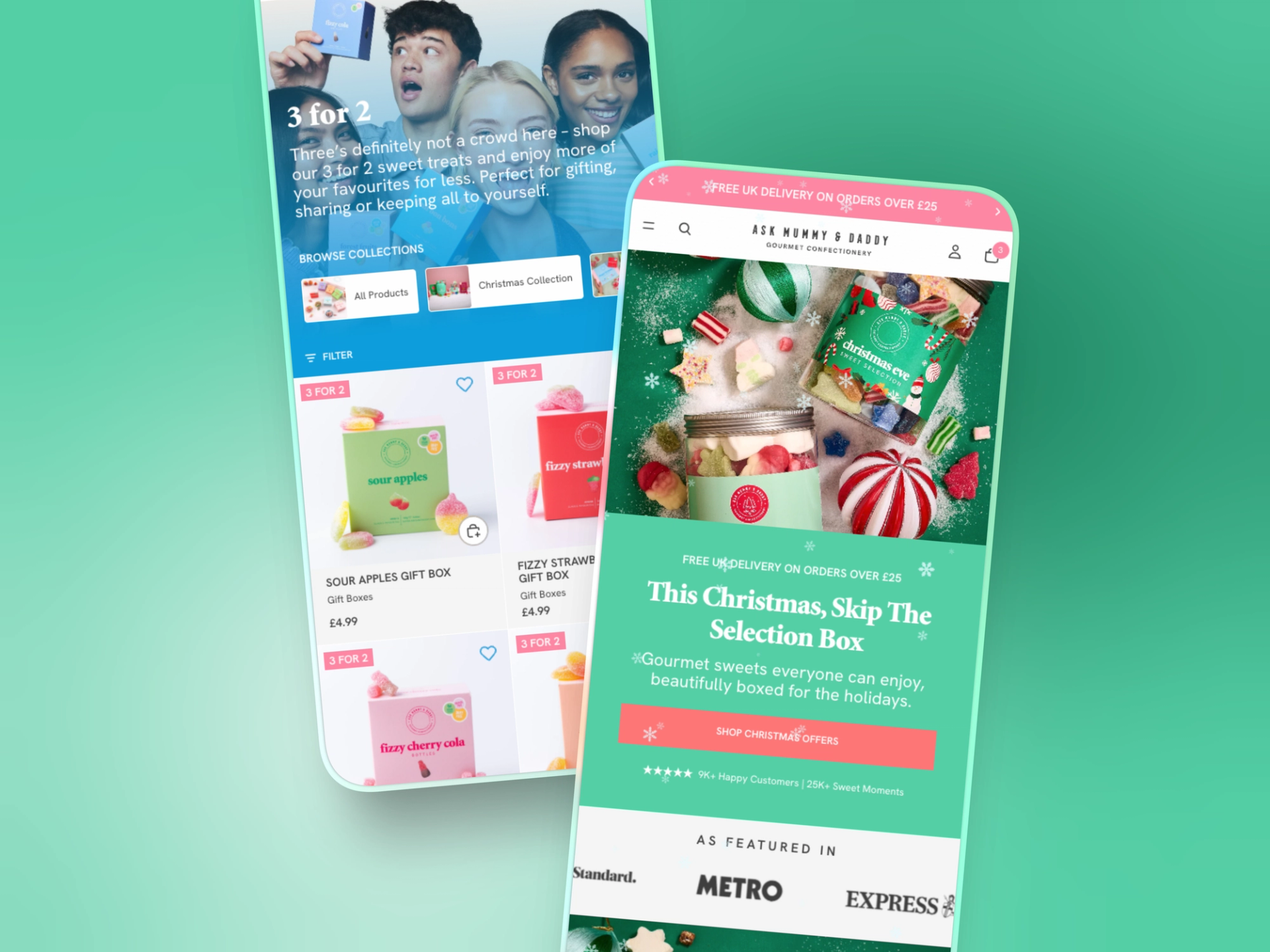
Ask Mummy & Daddy had clear brand guidelines, so the direction was simple: get out of the way of the products. They're colourful enough to carry a page on their own. We pulled apart references with Kane and the Glass team, then designed every key page in Figma and got sign-off before writing any code. Everything was aimed at four things: help people find products, help them find more, make adding to basket easy, and build enough trust to close.
2. Discoverability
The old site made you open a product page to find out anything. Now product cards let you swipe through images, see dietary tags and add to basket, variants included, without leaving the collection. A quick nav at the top of each collection links every other range. Dietary badges (plant-based, gluten-free, dairy-free, palm oil free) are generated from each product's ingredients, not ticked by hand. Manual upkeep is what caused the drift last time.
3. The buy box and the 3-for-2
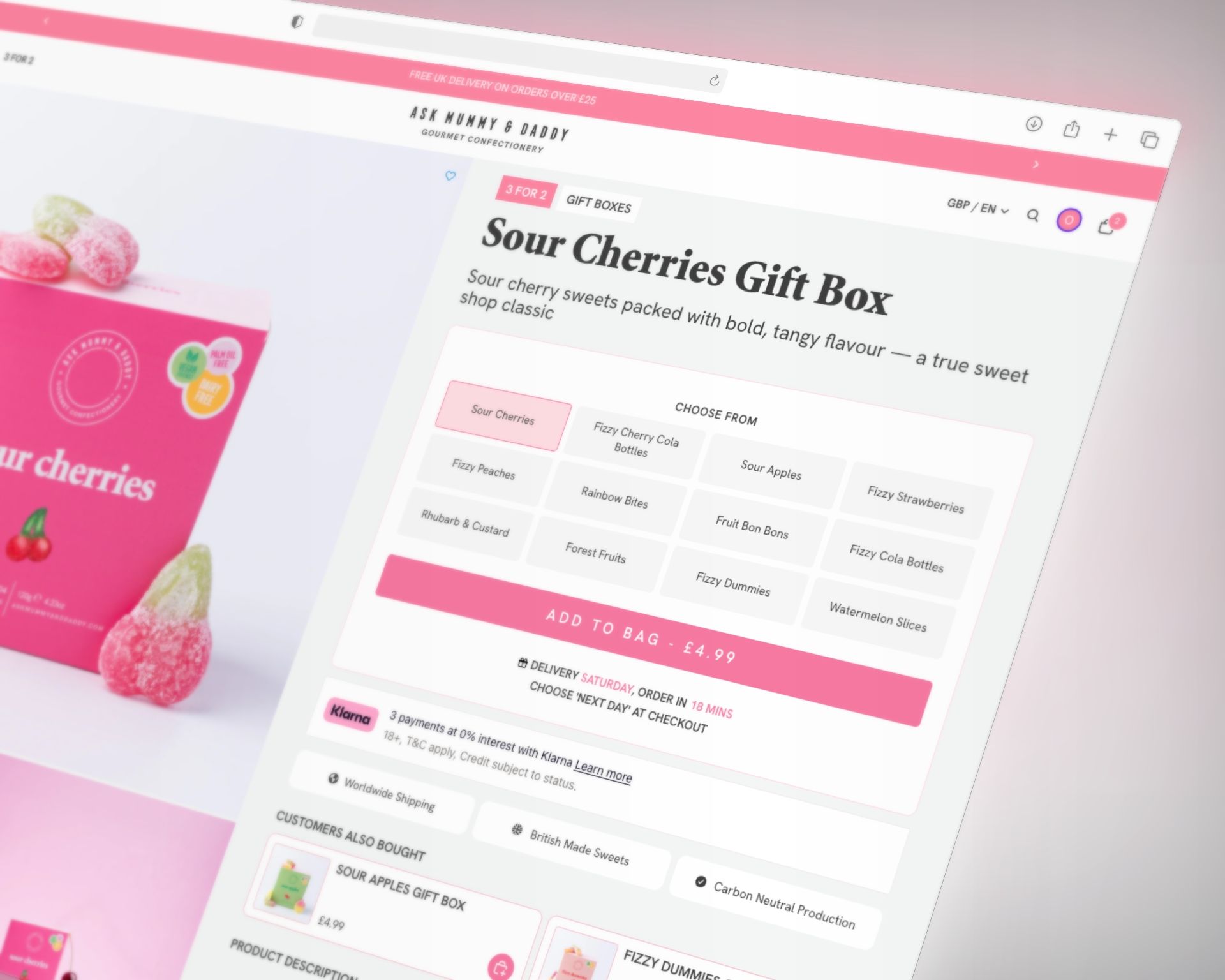
Each flavour is its own product, which is better for search and merchandising. But someone landing on Limoncello can't see the rest of the range. So the buy box pulls in every flavour from that collection, ready to switch or add together. A delivery estimate answers "when will it arrive" before it becomes a reason to hesitate. The permanent 3-for-2 offer used to be a banner. Now it runs from the homepage to the cart, where it prompts you to add more and shows what you've saved.
4. Keeping it focused
Kane has plenty of ideas, which is a big part of why the brand has grown. The question we kept asking wasn't "is this worth doing?" but "does it belong in this build?" Anything that didn't help conversion went on a list instead of into the sprint. That's why the site launched on time, why the numbers moved, and why there's a phase two worth having.


The results
Results
Shopify Analytics, 22 April to 21 July 2026, compared with the same length of time before launch. Order value grew more than twice as fast as conversion, so people aren't just buying more often. They're shopping differently.
+15%
Conversion rate
Driven by easier browsing and adding to basket straight from collection pages
+34%
average order value
The 3-for-2 and cross-sell prompts doing what they were built to do
+43%
Items per order.
Customers putting more in every basket
What's next
Where it goes from here
At the 90-day review we went back to Kane with the data and a plan: where the remaining conversion opportunity is, what to test, and what to build before Q4. Next up is landing pages matched to paid traffic for the holiday season, work on checkout drop-off, and a custom bundle builder for gifting.